Overview
A tax platform built for people navigating two systems at once
UNO Financial Services is a New Jersey-based accounting firm specialising in tax preparation, payroll, and incorporation services for immigrant and non-resident communities across the United States. Their client base — working professionals on H-1B, L-1, F-1 OPT, and Green Card holders — routinely faces one of the most confusing tax situations in the US: residency status rules, ITIN filing, visa-specific deductions, and multi-year compliance requirements.
The existing process was entirely manual. Clients would email documents, call the office, and wait. There was no structured intake, no transparency on status, and no way for the firm to scale beyond a handful of agents. The ask was to design and build a digital tax filing platform — from zero — that would let clients self-serve their intake while keeping accountants in control of review and submission.
The Problem
Manual intake was breaking the firm
Every tax season, UNO's agents were flooded with emails, WhatsApp messages, and phone calls to collect client documents. There was no standard form, no intake checklist, and no way to know which clients had submitted which information. Errors and omissions were common. Clients had to be chased repeatedly, often in multiple languages.
For immigrant clients specifically, the form complexity was a real barrier. Most generic tax software doesn't account for visa type, port of entry dates, months of US residency, or ITIN numbers — all of which are mandatory for non-resident filers. The cognitive load was high and the trust in digital tools was low.
User frustrations
Clients didn't know what documents to bring, which sections applied to them, or where their return was in the process. Every question required a call or email.
Business frustrations
Agents manually tracked every client, re-entered data from emails into software, and had no visibility into pipeline. Peak season was chaos with no throughput.
Design Process
From discovery to end-to-end flow
I ran a structured discovery across four weeks — interviewing UNO's accountants, reviewing their manual intake forms, and speaking with five existing clients about their tax-season experience. This gave me a clear picture of both the filing complexity and the emotional friction involved.
"The biggest design challenge wasn't the form fields — it was deciding which questions to ask, when to ask them, and how to make a non-resident filer feel like the form was built for them."
Design Insight — UNO Financial Project
The Solution
A structured, stepped filing experience designed for non-resident filers
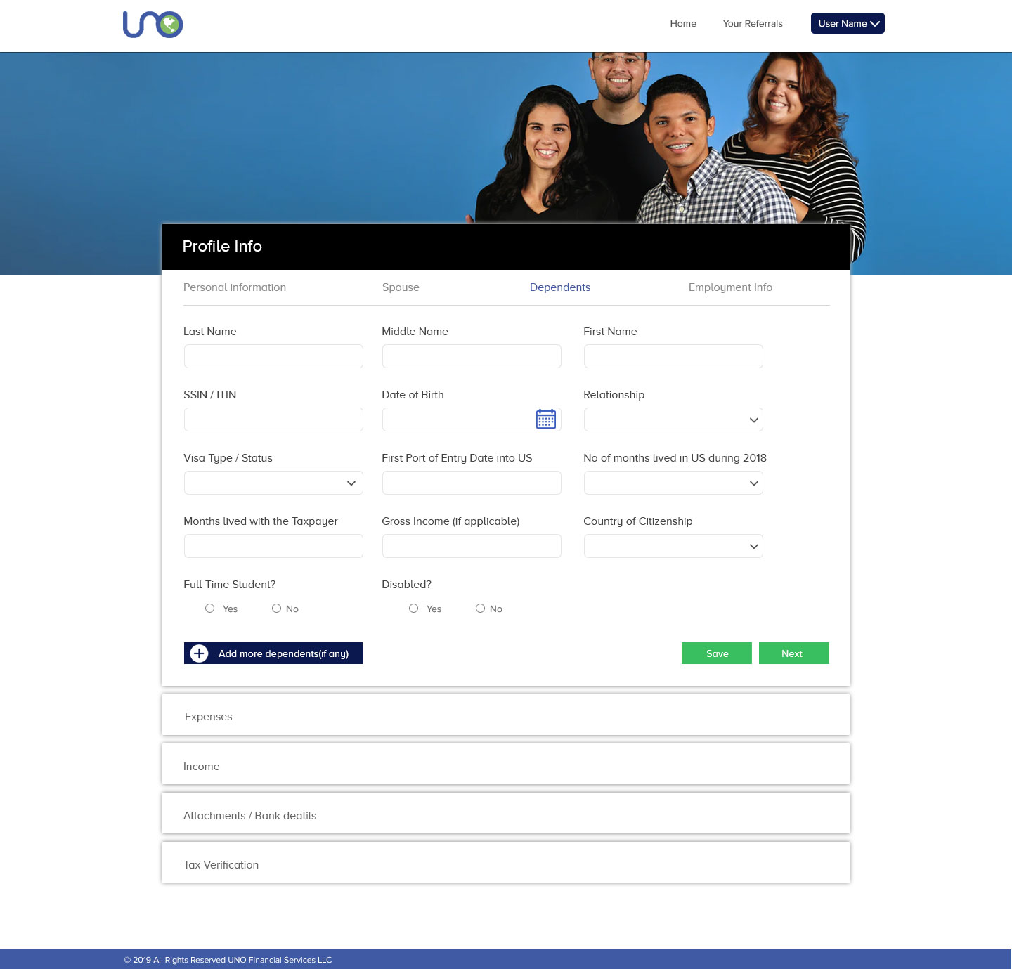
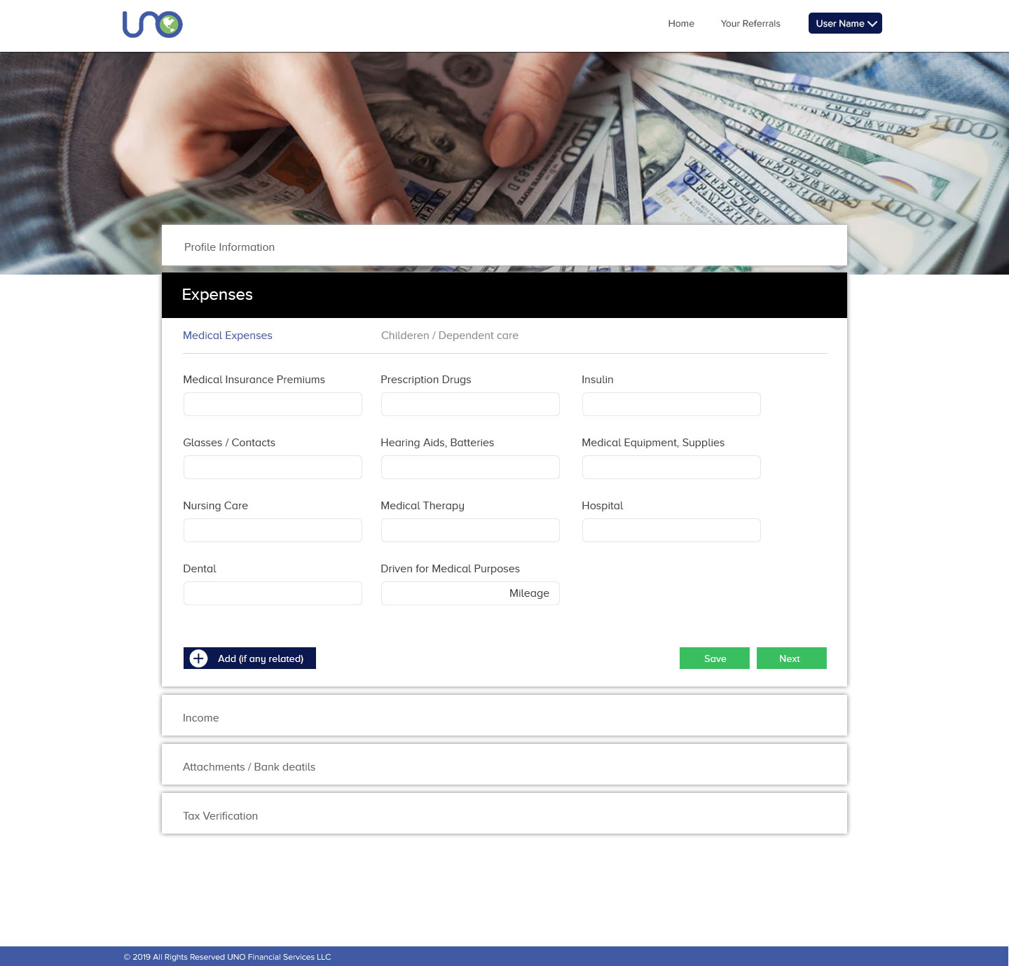
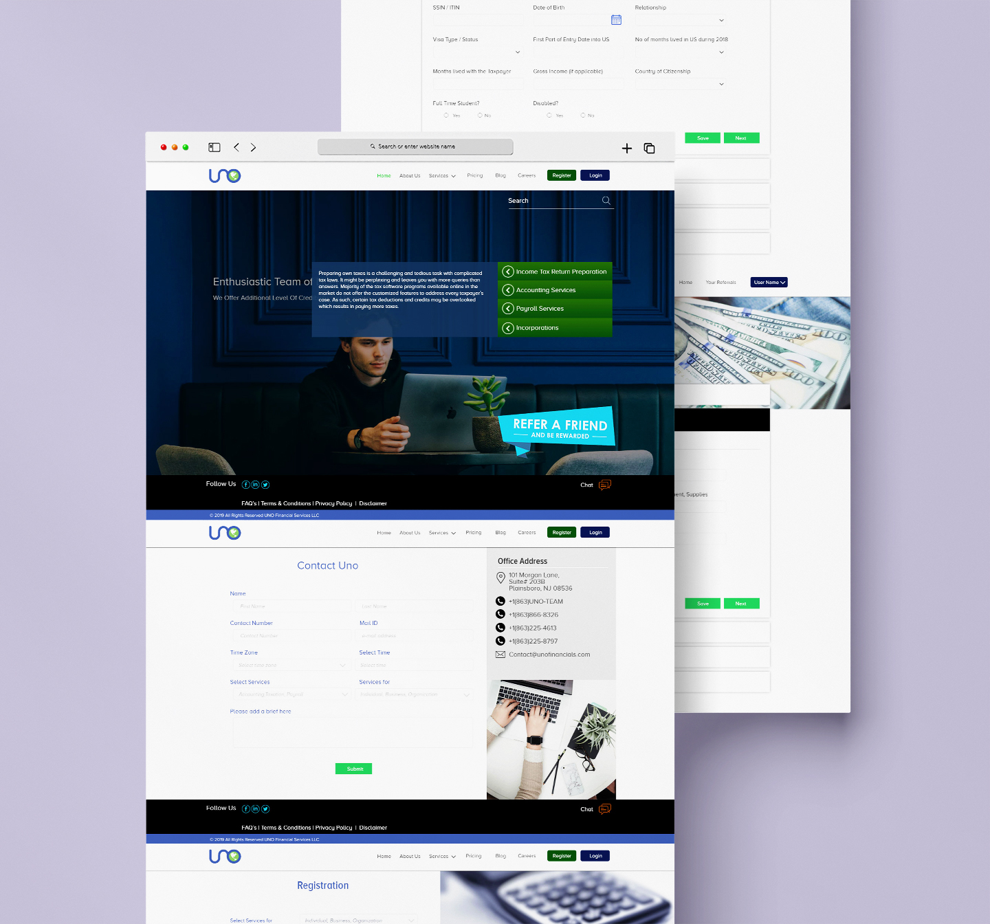
The application was structured as a multi-section accordion flow — Profile Information, Expenses, Income, Attachments, and Tax Verification — giving clients a clear sense of progress and allowing them to save and return at any point. Each section surfaced only the fields relevant to the user's visa status, reducing cognitive load significantly.
Design Decisions
What shaped the interaction model
Accordion progress model
Each major section (Profile, Expenses, Income, etc.) lives as a collapsible accordion panel. Clients complete one section at a time, with the current section expanded and remaining ones locked until prior sections are saved. This kept the experience linear without a complex multi-page navigation.
Sub-tabs within sections
Within sections like Profile Info, sub-tabs handle Personal, Spouse, Dependents, and Employment data separately. This prevented overwhelming single-page forms and allowed clients to navigate back to specific sub-sections without resubmitting the entire section.
Visa-aware field exposure
Fields like "First Port of Entry Date," "No. of months lived in US," and "Visa Type/Status" were surfaced only where required — directly addressing the non-resident filing complexity that generic tax software ignores entirely.
Save + Next pattern
Every sub-section offered both a Save (persist without advancing) and a Next (save and move forward) action. This let clients leave and return mid-completion — important for a user group that often needs to locate documents before finishing a section.
Outcomes
What the platform changed
Reflection
What I learned
Designing for a domain as specific as US immigrant tax filing taught me how much domain knowledge matters in UX. Generic form patterns fail when the underlying logic is complex — you need to understand the system before you can simplify it for the user.
The biggest tension was between completeness and approachability. Tax forms require a lot of data, but overwhelming a first-time user kills completion rates. The accordion + sub-tab architecture was my answer to that tension: everything is there, but you only see what you need when you need it.